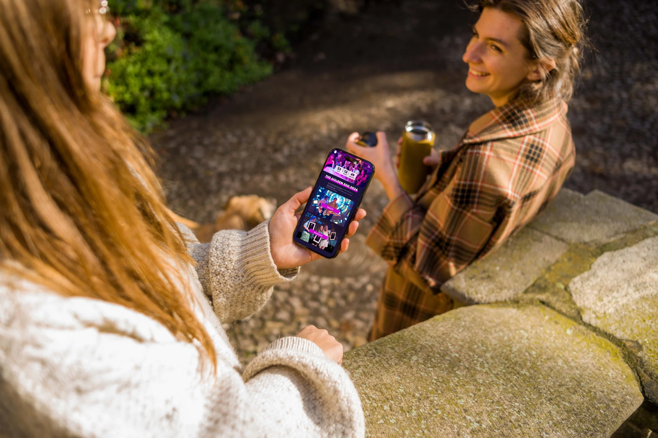
The Golden Egg 2024 is a prestigious awards ceremony celebrating the creativity and talent of Noroff students across Norway. It´s a unique opportunity for students to showcase their work to a wider audience, recieve valuable feedback from judges, and potentially win exciting prizes.

Type of project: Assignment at Noroff, re-design of current website for mobile and desktop
Role: UX-designer
Team/Individual work: Team of four students
Duration: 3 weeks
The task
Re-design of the Golden Egg website. The logo and fonts were already chosen for us, but we could make changes to other parts of the design system.
The best final product submitted would be chosen to be implemented ahead of next year's Golden Egg Awards.

Our process

For The Golden Egg we are designing for both mobile and desktop. Given that a significant portion of users access websites via mobile devices, prioritizing mobile design enhances the overall user experience. Because of the limited screen space on mobile, we went with mobile first design approach. This helped us to remove clutter and prioritise the content, leading to a more focused user experience and improved navigation.
Mobile first
Mobile first and content first goes hand in hand. We started our design process with a content audit of the current website, ensuring that the content would drive our decisions.
As a group we carefully went through the content needed, determining the most essential elements and what to communicate to users. Using content first as a method also simplified both our sketching and wireframing process.
Content first
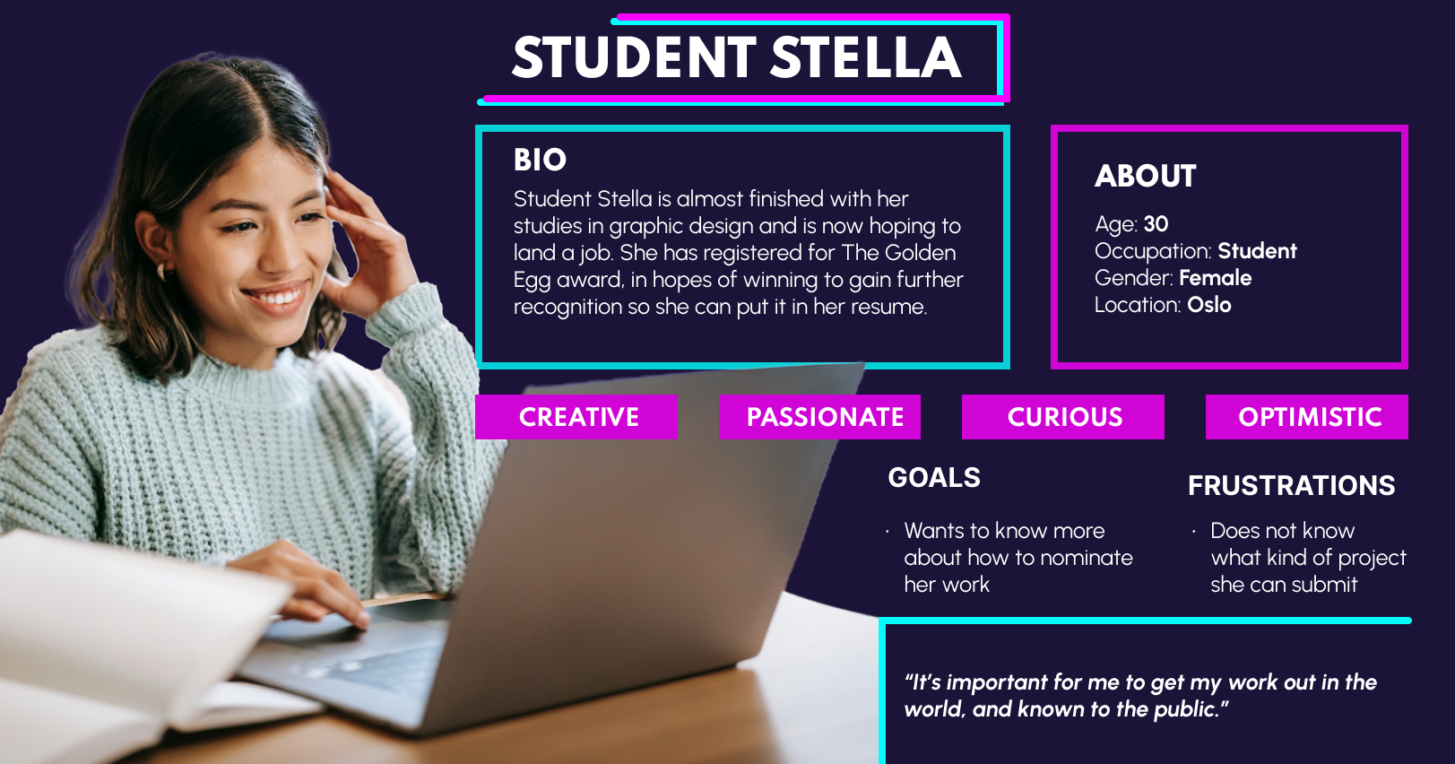
Persona
Style guide
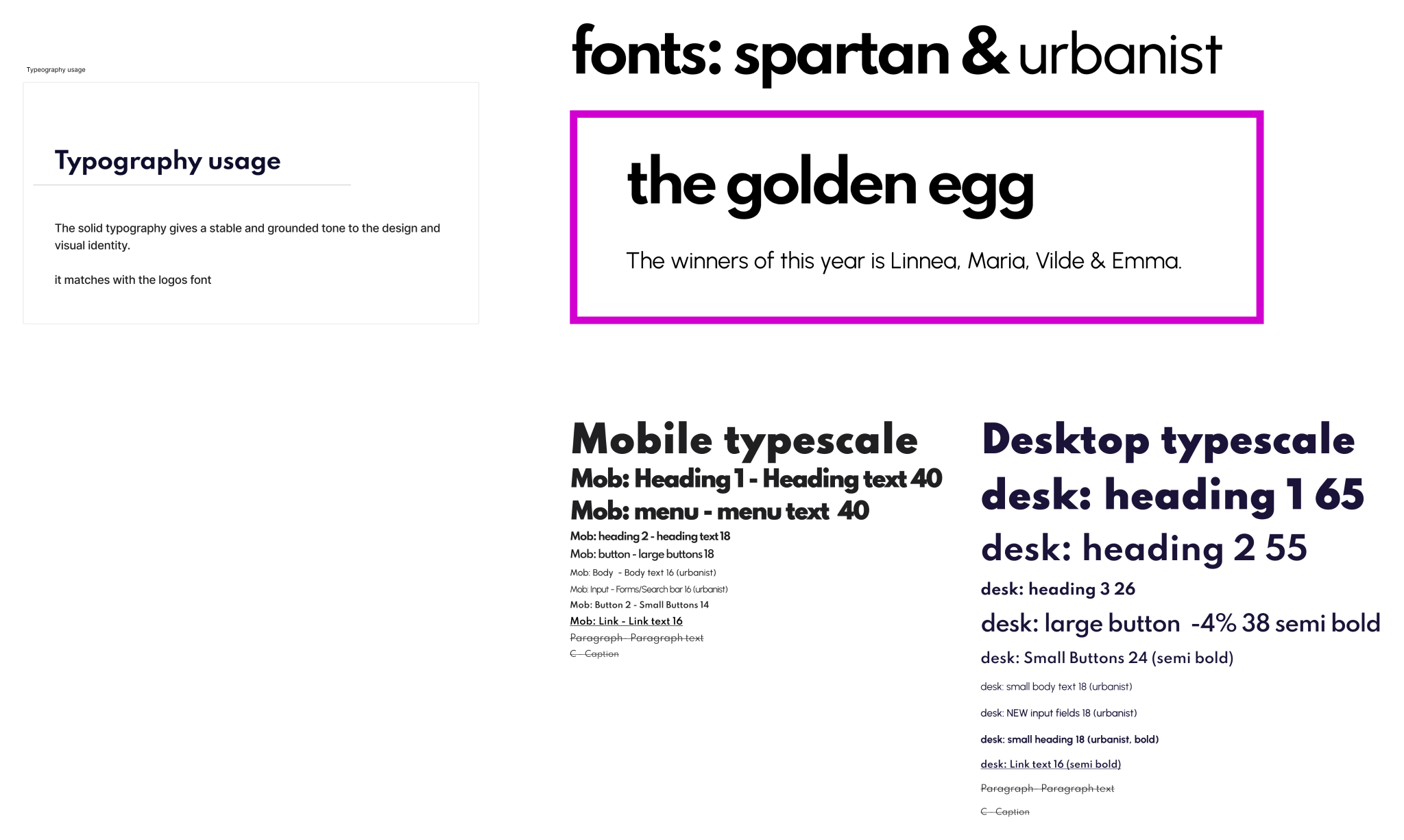
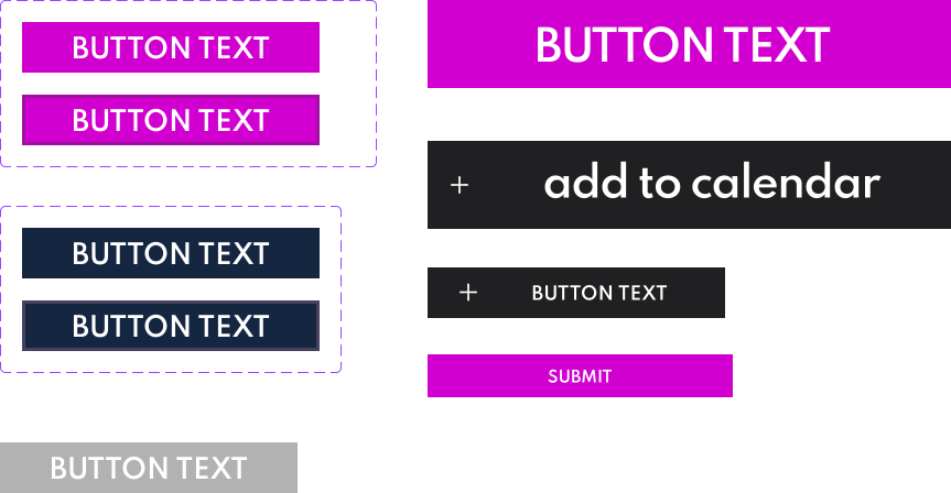
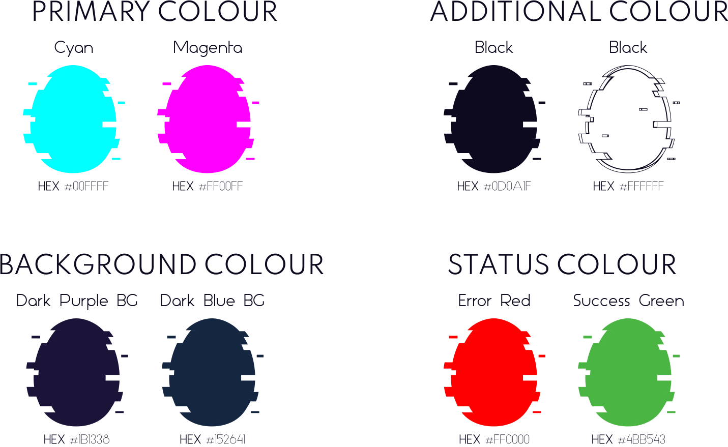
With a dark purple backdrop and accents in white, magenta, and cyan, our website aims to radiate contemporary flair and energy. We want to maintain consistency with the current logo of both The Golden Egg & Noroff by keeping our design sleek and sharp-edged.
The visual style is modern and welcoming, featuring crisp lines and interesting fonts. By showcasing images from past events, we want to foster a sense of community & belonging. Our ultimate aim is to craft a website that not only informs but also ignites inspiration and encourages students engagement.
Design language & identity

After creating our persona, researching, making the information architecture and getting inspiration from similar products, we started sketching.
During our sketching sessions we worked both separate and in collaboration, giving each other feedback and discussing content and best solutions.
Sketching


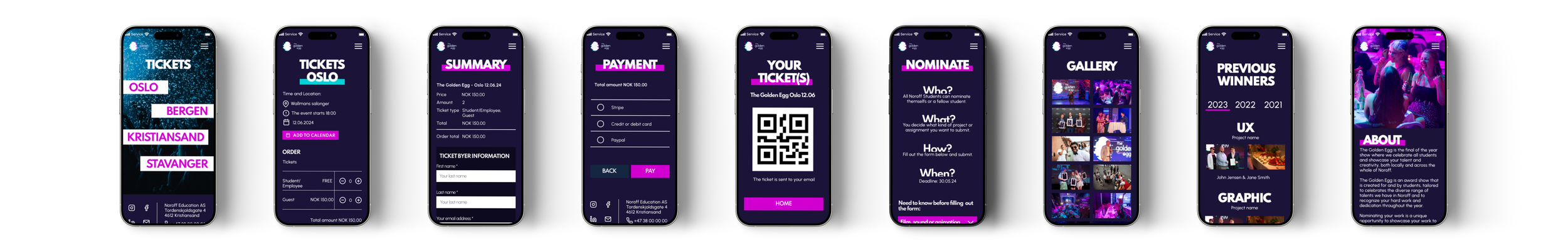
Mid-Fi

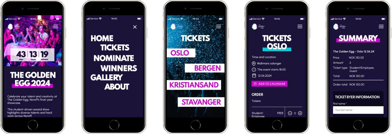
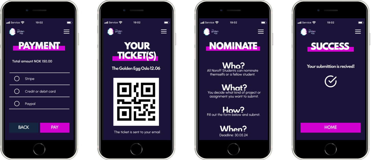
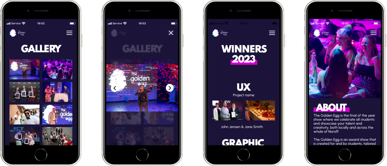
Hi-Fi Mobile
Hi-Fi Desktop


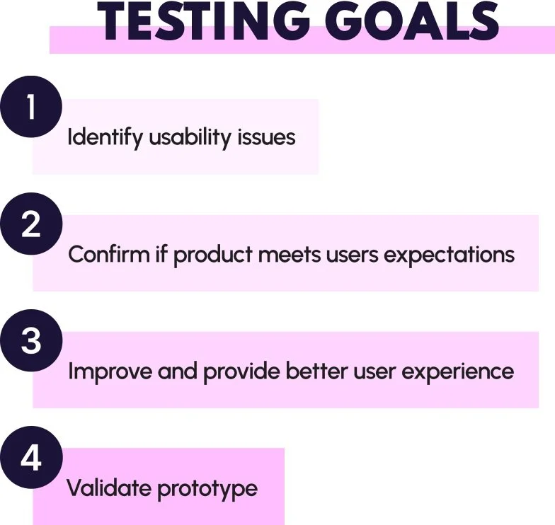
As part of The Golden Egg website redesign project, this task involved conducting usability tests and implementing design iterations based on the feedback.
Testing
As the website targets Noroff students, we choose a guerrilla approach to recruit participants. We approached fellow students on campus and asked if they'd participate in the usability test, ensuring they met our criteria.
Five participants were recruited for the usability test, along with one pilot test and one A/B test.
Screening & recruiting
Mobile first
We decided to test our mobile solution for this usability tests due to it being the smallest screen.

We chose test locations based on where our primary users would likely engage with the product— at school or at home. Conducting three tests at Noroff Campus and two at students' homes ensured diverse usage scenarios. Both settings provided a calm environment with minimal distractions.
Five participants were recruited for the usability test, along with one pilot test and one A/B test.
Test location
Methods & techniques
All usability tests were moderated in-person and semi-scripted. Every team member took turns facilitating one or more tests.
Participants were given the scenario and the two tasks to preform on mobile, and were encouraged to think aloud throughout the session. Follow-up questions engaged the retrospective think-aloud technique, encouraging participants to reflect and elaborate on their experiences.
Through measuring these KPI´s we were able to identify usability issues and get closer to our primary users mental model. Most importantly giving us the insights to improve the user experience of the product.
Why is it important?
All participants finished the tasks. Two errors were non-critical mis-clicks due to unsupported choices in the prototype. The third error was a mis-click on a checkbox due to inaccurate targeting.
After each task, participants rated their experience on a scale from 1 (lowest) to 5 (highest). Overall, they reported high satisfaction.
Results
Metrics

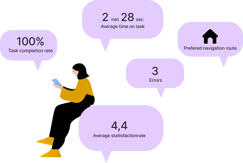

We were interested in discovering the participants' preferred navigation route.
For both tasks, the landing page was the most preferred navigation route.

Analysing & synthesising
Affinity mapping
Facts from the usability tests were written down on sticky notes. We then used affinity mapping as a tool to organize the sticky notes. Facts that were related to each other were grouped together in categories.
The sticky notes were then voted upon through dot voting.
MoSCow technique
The team continued to sort the dot voted sticky notes after prioritization through a version of the MoSCow technique.
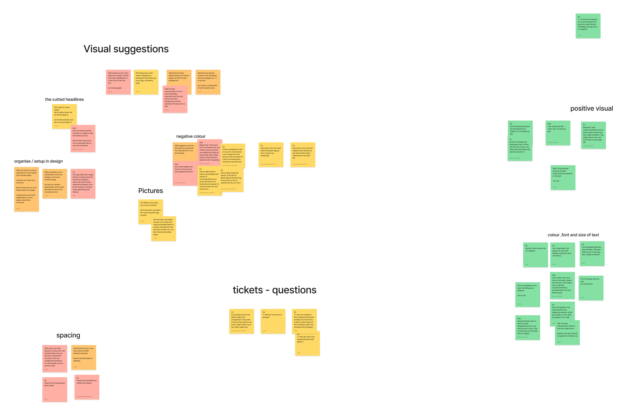

Insights & recommendations
Talking about each sticky note we voted upon helped us understand insights from the usability testing.
We learned from the observations and feedback of the test participants how to improve the design and make our product more user-friendly.
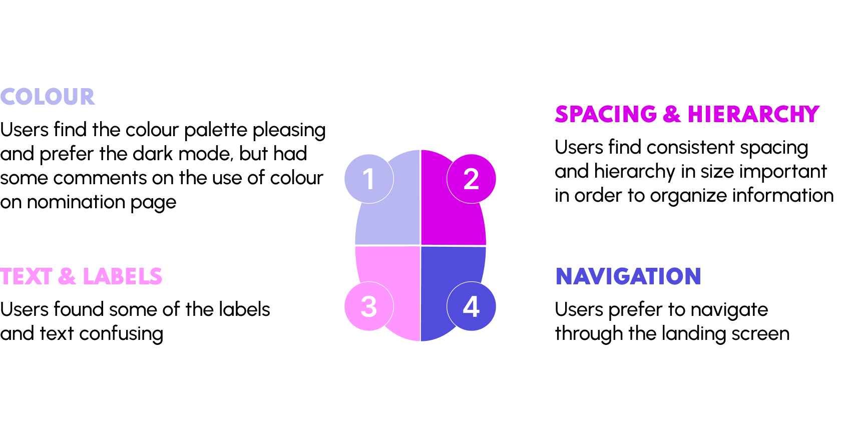
Key findings
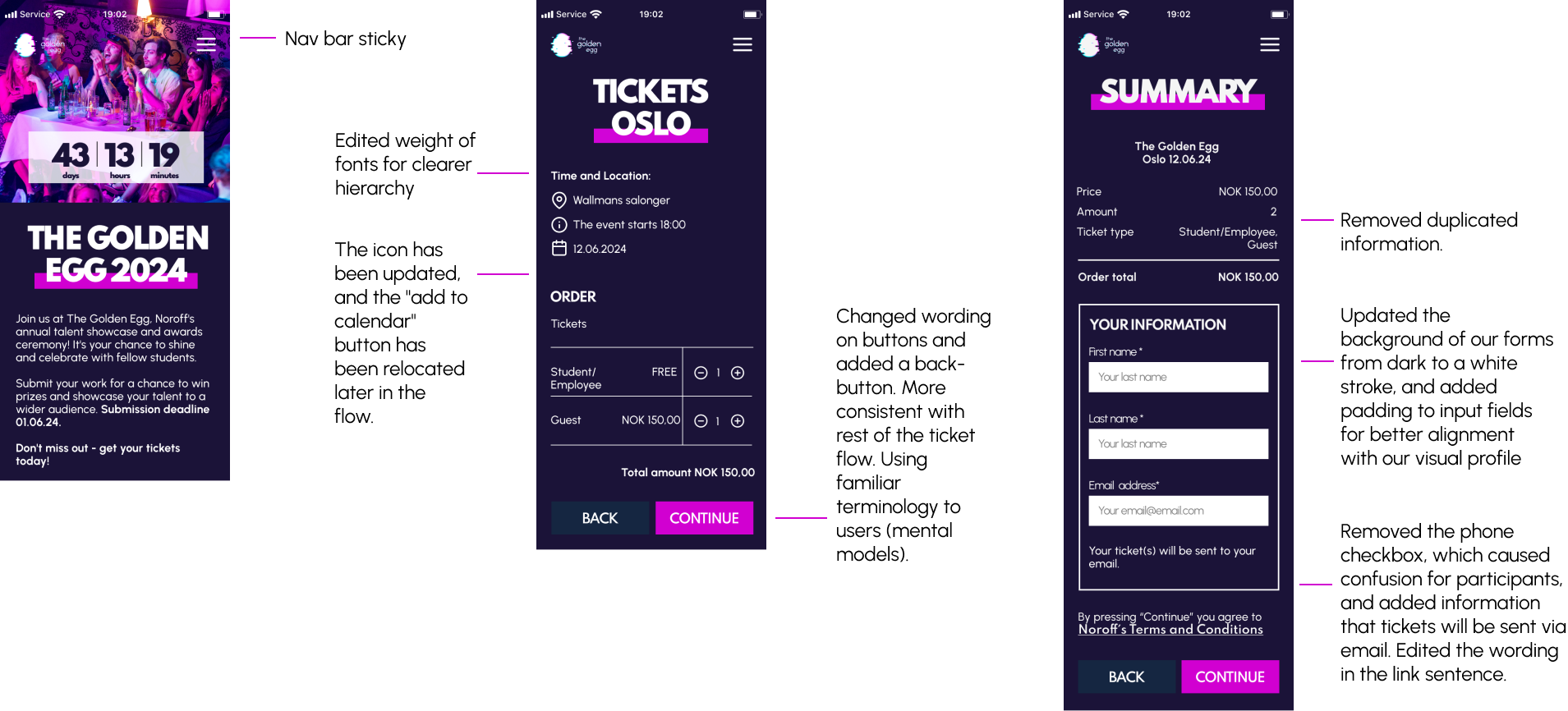
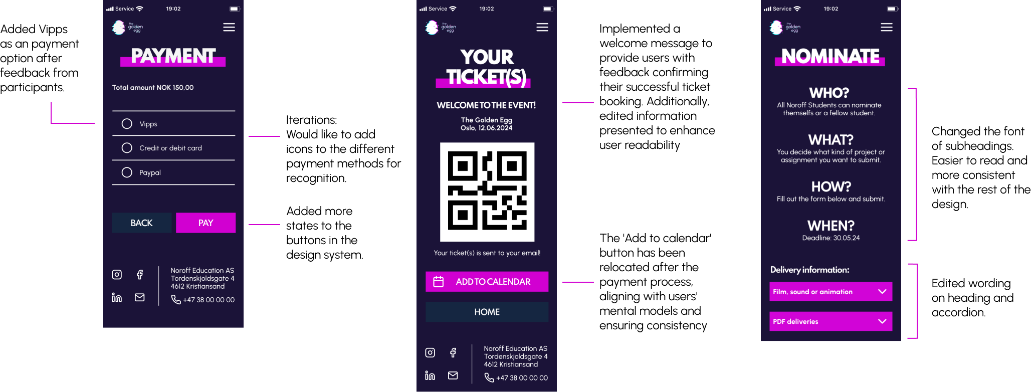
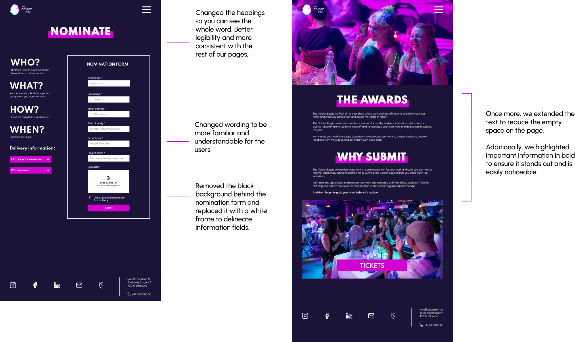
Design iterations


Results & takeaways
My responsibilities in this group projects include conducting a content audit, sketching, creating specific wireframes (we divided the frames so each team member would do design work in Figma), conducting two usability tests and gathering facts from these tests. Turning those facts to insights together with the rest of the team. And lastly iterate the design.
We collaborated well throughout this project. Each team member brought a set of skill that they excelled at. Not only making the team complete, but it was a great opportunity to learn from each other.
My role
Amongst the other submissions, our final solution was chosen to be implemented before next year's event.
Working in a team - Collaborating with my team was beneficial due to diverse perspectives. I learned the value of collective problem-solving.
Usability testing - Thorough usability testing was the key to insuring a final product that is both engaging and functional.
What I learned